
How much weather information can you deduce in the time it takes to drink a cup of tea? Meteorologist Simon Rowell on understanding the weather of the day

There is now so much weather information available online. There are apps and websites that will give you forecasts every hour for any location, down to previously unheard of spatial resolutions. These are really useful and really convenient, and all you need to do is browse through the ones that are colourful and easiest to use and choose the forecast that suits you best… right?
Wrong! While it’s undoubtedly true the many different ways to get information are very useful, they don’t automatically lead you to the best result. It’s a bit like sat-nav: if you use it all the time you forget how to read road maps and how to keep your sense of direction.
The ‘Mark 1 eyeball’ is still one of the best weather observation tools around, and this is how I start my morning weather forecast. Every day I’ll make myself a mug of tea, go outside (or on deck) and watch the sky. It’ll take a few slurps of tea for the grey matter to kick in, but then I’ll start to notice things.
To begin, I’m looking for what sort of sky it is. There are almost always clouds around, but are there lots? Is the sky covered? Is it raining? Next, which way are the clouds moving? This is a great way to look at the overall synoptically-driven wind.
In the early morning, especially, the air at the surface may be disconnected from the movement above and it will take a bit of heating for the synoptically-driven wind to mix its way down to the surface. Also, if you’re on a boat then you’re likely to be moored or anchored somewhere sheltered from whatever the weather is doing.

Weather forecast models comparison on Windy.com
Bigger picture
Once I’ve got this worked out (and finished my tea) then I’ll go and look at the bigger picture. The clouds I’ve just seen will be part of a larger synoptic feature, a depression or a high pressure system perhaps, so I’ll look at the Met Office synoptic charts to see what’s with us now (the most recent analysis chart) and the next available forecast charts.
I do this to get an overall context – as an example the high wispy clouds that just looked lovely in the morning light may well be the first clouds ahead of an incoming warm front. Then I’ll look at the latest satellite image, and sites such as zoom.earth allow you to see this overlaid with the rainfall radar in almost real time (a 15-20 minute lag usually).
This allows me to see that the features on the chart are backed up by what’s actually happening – a really important stage. Not including brewing my tea, this whole process has taken about five minutes.
By now I’ve got an idea of what’s going on, something like: ‘There’s a cold front forecast, it’s over Dartmouth now and if I look at the rain radar it’s taken four hours to get there from Lands End, so I reckon I’ve got about four hours before it gets to Portland.’ This is useful info, and is based on real observations. My personal favourite source of UK weather is the Met Office, so I’ll then go to their website and get the hour-by-hour conditions for where I happen to be.
Article continues below…
However, I’d like a second and even a third opinion, and possibly also to download data to use in my navigation software. So next I’ll go onto an app that I’ve used before and understand. And by understand, I mean that I know where they get their source data from, when they get it (so it’s not delayed), and have an idea of what processing they apply to get the resolution they claim.
Reliable sources
There are many apps, and most get their data from NOAA (the US equivalent of the Met Office). Some get it from ECMWF (the European Centre for Medium Range Weather Forecasts based in Reading) and the Met Office, as well as other national agencies in Europe and beyond. A good example of these is Windy.com.

The land here is about 60m high – a south-westerly is funnelled up the east side. This is missed by all the models as it’s too small a feature
It’s a good idea to know the spatial resolution of the models – the ECMWF model has a 9km resolution, NOAA’s 22km, compared to the Met Office’s 1.5km around the UK. These are all professional and sensible choices, and have their own separate forecast models so make for good independent comparisons.
This comparison is important – if all the data sources say roughly the same thing, then I’m going to be confident the forecast is of good quality. If they all say something different then my confidence in the forecast goes down – and this is a really useful bit of information, as it’ll affect how ambitious your plan for that day is. Also, a low confidence forecast makes the use of your barometer, wind instruments and physical observations (looking for clouds, feeling a change in air temperature etc) even more important.
What’s missing?
One thing to remember with ‘high resolution’ forecasts is that they’re only as good as the models that underpin them. In the Rio Olympics in 2016 the single most important feature was Sugar Loaf, at what was usually the windward end of the medal race course.
This is a 396m high huge dome-shaped rock – but it’s much less than 1km wide and doesn’t show up at all on any of the land models used for weather forecasting! This is not a criticism, it’s a function of the computer model.
In general the smallest thing that can be simulated by a model is 3-4 times the size of the grid used. This means that a 1km resolution forecast won’t see anything that is less than about 3-4km across.
Shipping forecast
Back to my 15 minute forecast. By now I’ve got a good idea of what is forecast to happen throughout the day, which I’ll write down in my logbook if I’m sailing. I tend to go to the Inshore Waters forecast and the Shipping Forecast, both available on the Met Office site if I’ve missed the broadcast, to look for sea state and a confirmation of the weather. I’m up to 10 minutes now.
The thing with sailing around a coastal area, however, is that a lot of the weather features are what I like to call ‘sub-grid’ – ie they’re caused by land features which, as we’ve discussed, don’t show up on the weather models.
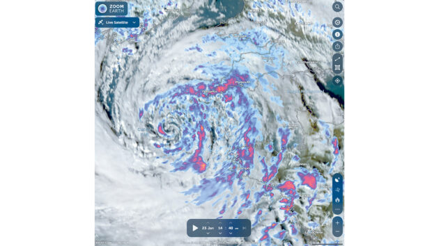
A typical zoom.earth live satellite image of weather systems as they happen
The most civilised way to sort through these is to stop the forecast clock long enough to brew another tea, then sit at the nav desk with your forecast, a chart and a pencil, and sketch out the incoming wind going through any gaps and around or over any obstacles.
This should allow you to predict, for example, funnelling up the east side of Carrick Roads in a south-westerly (see above left); the way a westerly tends to become west-north-west going down Southampton Water; and that in a strong north easterly it howls around the top of Anglesey.
By now we’ll be at the end of our 15 minutes – not only with a good forecast firmly in mind, but also an understanding of what the weather is that’s coming through. This means that as the day goes on if, for example, the front slows down and you don’t get the lowering clouds you initially expected, then you can confidently say that the veering wind will come along later, or you’ve got a bit more time before the showers hit.
This way the knowledge you gave yourself at the beginning of the day will translate into better understanding of what’s going on – and what is still to come.
And you’ve enjoyed a mug of tea in peace.
 If you enjoyed this….

Yachting World is the world’s leading magazine for bluewater cruisers and offshore sailors. Every month we have inspirational adventures and practical features to help you realise your sailing dreams.Build your knowledge with a subscription delivered to your door. See our latest offers and save at least 30% off the cover price.
Note: We may earn a commission when you buy through links on our site, at no extra cost to you. This doesn’t affect our editorial independence.